Accessibility design ensures that everyone, regardless of ability or context, can comfortably use your digital product. Digital accessibility is addressed in legal standards (such as WCAG) because it is about creating an inclusive experience that can benefit any user-someone with a permanent disability, an older adult navigating a small mobile screen, or even a distracted commuter looking for quick clarity.
Why it matters
- Reach a wider audience: A more accessible product could help every user, expanding your potential market.
- Improve overall UX: Accessibility often uncovers usability issues that affect everyone, not just people with disabilities.
- Stay compliant: Standards such as WCAG 2.1 or 2.2 are often required by law in many regions. In Europe, the European Accessibility Act (EAA) comes into force in June 2025 which will improve the trade of accessible products and services.
In this guide, we’ll explore key areas such as color usage, interactive elements, forms, navigation, content, and how to document it all so your team can apply these practices consistently.
Are you just getting familiar with digital accessibility? Have a look at our previous article first “Understanding Accessibility: A Gateway for Inclusive Design“.
Designing with accessible color palettes
Color is one of the first things designers think about, and it’s critical to accessibility.
Understanding contrast ratios
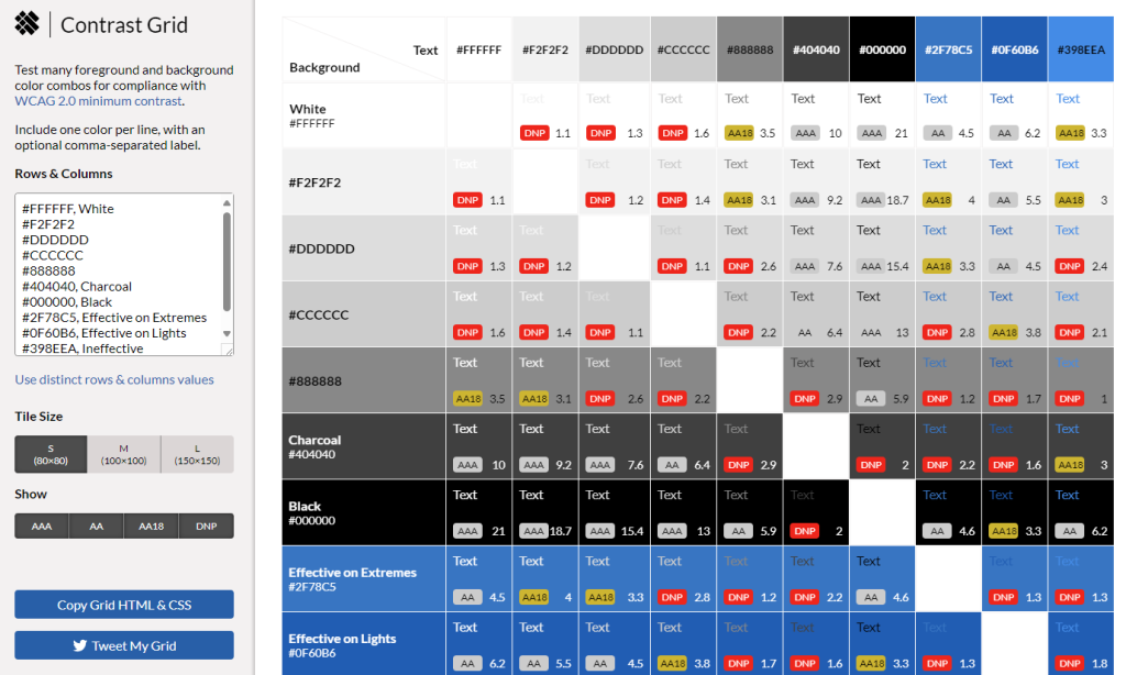
- The basics of contrast ratios: For most text under 24px (or 19px if bold), aim for a ratio of at least 4.5:1 against its background. Larger text (24px and above, or 19px bold) can drop to 3:1.
- Non-text elements: UI components such as icons or buttons also need a contrast ratio of at least 3:1 to be easily distinguishable.
Why it matters
People with low vision or color blindness rely on sufficient contrast to read or interact effectively. Without it, important information or interface elements become invisible to them or the screens can’t read the elements.
Creating an accessible color palette
- Choose base colors: Select primary, secondary, and accent colors.
- Validate each pair: Use free tools (e.g., WebAIM’s Contrast Checker or Contrast Grid) to ensure that each text/background combination has the correct ratio.
- Create variations: If a color fails the contrast check, create lighter or darker variants that pass.
Document usage
Outline the purpose and acceptable pairings of each color. For example, show how your primary brand color works with both light and dark text. This can be done in a spreadsheet, a figma file, or design system documentation, along with examples of components (such as buttons) so developers know how to use them.
Accessible links and buttons
Interactive elements (links and buttons) are everywhere. It’s important to make sure they’re clear, consistent, and navigable.
Make your purpose clear
- Descriptive text: Instead of “Click here,” use text such as “Learn more about our accessibility guide” so that users (and screen readers) know immediately where to go or what to do.
- Consistent styling: Links and buttons should be visually distinct. Underline links, use color changes on hover, and make sure the user can easily tell they’re clickable.
Interactive states
- Default: The resting style of the element.
- Hover: Changes when the cursor hovers (e.g., color change, underline).
- Focus: A clearly visible outline or style when the item is selected by keyboard or assistive device.
- Active: The appearance when the item is clicked or pressed.
- Visited (for links): A color change that indicates it’s been visited before.
- Disabled: Grayed out or obviously non-interactive.
- Recommended size: Aim for a 24×24px target area.
Making forms usable and error-free
Forms are often choke points, especially when it comes to accessibility.
Error Handling and Messaging
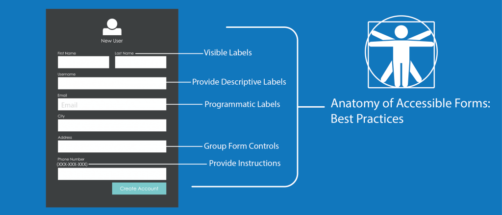
- Prevent errors first: Keep forms as short as possible. Use clear labels and wildcards so people know what’s expected.
- Use descriptive error messages: Instead of saying “Error in field,” say: “Password must be at least 8 characters long.” This clarity helps everyone.
- Highlight errors visually: Display red outlines or bold text for invalid fields. Combine these visual cues with text or ARIA alerts for screen readers.
States in form fields
- Default: The normal, unselected field.
- Focus: A highlighted border or background color when a user tabs in.
- Checked/Unchecked (for checkboxes/radio buttons): Visual check or dot; mention for screen readers with aria-checked.
- Disabled: Grayed out or not clickable.
- Indeterminate (e.g., partially selected checkboxes in multi-select scenarios): Show a dash or partial fill, and indicate for assistive tech.
Semantic HTML and ARIA
- Use the Right Elements: <label> for labels, <input> for data entry, <button> for actions. This natural semantic structure reduces the need for additional ARIA attributes.
- ARIA Roles and States: If you’re building custom components, you might need to specify role=”button” or aria-expanded=”true”. Only do this if semantic HTML alone isn’t sufficient.
Keyboard navigation and focus management
Many users rely on a keyboard or other non-mouse input, which is why you need to ensure your site can be navigated without a mouse.
Skip links and logical focus order
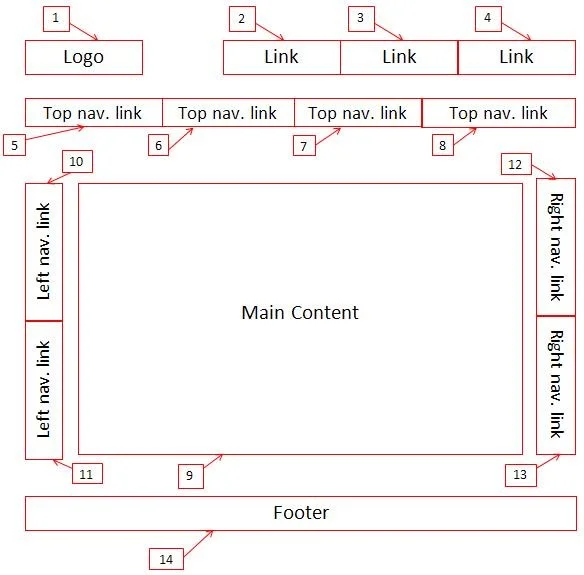
- Skip Link: A link at the top that allows users to “skip” to the main content, bypassing repeated navigation elements.
- Focus Order: Establishing a natural tab order. For example, tabs should move through menu items, form fields, or links in a top-to-bottom or left-to-right flow.
Focus indicators
- Visible outline: A strong outline (often a bright or contrasting color) around the element currently selected by the keyboard. Avoid removing this with CSS (outline: none;) unless you replace it with an equally visible style.
Structure your information architecture
Properly organized content helps screen readers, search engines, and everyday users find what they need quickly.
Headings and hierarchies
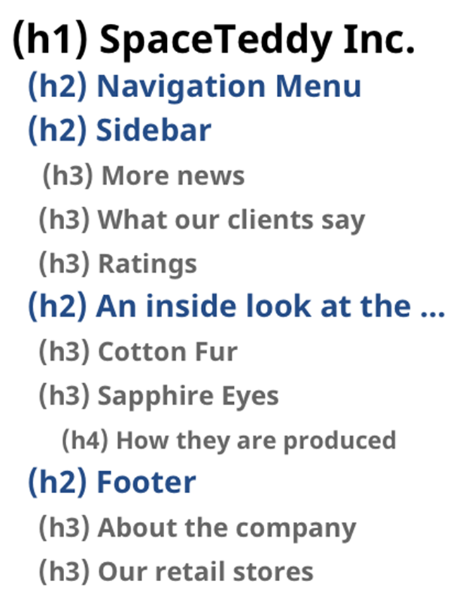
- Levels matter: Follow a logical order (<h1>, then <h2>, <h3>, etc.). Don’t skip levels (e.g., jump from <h1> to <h4>).
- No style headings: Don’t just make a paragraph bigger and call it a heading. Use actual heading tags to maintain accessibility.
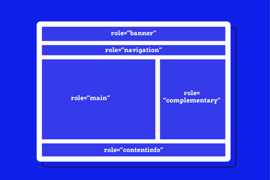
ARIA Landmarks
- Define regions: Use HTML5 elements such as <header>, <nav>, <main>, <footer>, or ARIA roles such as role=”navigation”, role=”main” to mark important areas of the page.
- Streamlined navigation: Screen reader users can jump directly to these landmarks, speeding up navigation on complex pages.
Accessible content: Images, Audio, and Video
Any media you include should be accessible to users who can’t see or hear it.
Images
- Alt text: If an image conveys important information, describe it in the alt attribute. For purely decorative images, use alt=”” to indicate that no description is needed.
- Icon Buttons: If a button is just an icon (like a magnifying glass), make sure it has an accessible text label (e.g., aria-label=”Search”).
Audio/Video
- Captions and transcripts: Provide captions for videos. For audio or podcasts, provide written transcripts.
- Control autoplay: Avoid autoplaying audio, or at least allow users to quickly stop/pause it, especially if they’re using assistive devices.
Documenting accessibility in your workflow
Maintaining good documentation helps keep your entire team on the same page.
Choosing the right tools
- Jira or Confluence: Great for centralizing policies and tracking tasks.
- Miro Boards: Visual collaboration that can combine mockups with annotations.
- Word/Excel or Google Docs: Simple, shareable, but can become unwieldy if not well organized.
- Figma accessibility kits: Many kits are available to annotate color contrast, focus states, and ARIA usage within your design file itself (e.g., “A11y Annotation Kit” or “Web Accessibility Annotation Kit”).
Examples of effective documentation
- Mockups with notes: Show exactly where color contrast is important, which elements require ARIA roles, and how interactive states change.
- Cross-team checklists: List tasks from design to QA, ensuring that no accessibility detail is overlooked.
Recap and Action Steps
Key Takeaways
- Color contrast: Always test your palette.
- Clear links/buttons: Descriptive text and obvious states.
- Form Accessibility: Use semantic HTML and well-crafted error messages.
- Keyboard/Focus: Provide skip links and visible focus outlines.
- Information Architecture: Use logical headings and ARIA landmarks.
- Accessible media: Alt text, captions, and transcripts.
- Documentation: Centralize your policies so everyone on the team can refer to them
How to move forward
- Tackle the basics: Start by making sure color contrast, keyboard navigation, and form labels are correct.
- Iterate and evolve: Regularly review and update your accessibility documentation as your product grows.
- Collaborate: Make accessibility a shared responsibility, involving designers, developers, testers, and stakeholders.
Additional resources and inspiration
Web Accessibility Annotation Kit
Put Accessibility into Action
Designing for accessibility means respecting your users, anticipating their needs, and providing a smooth, equitable experience. By implementing simple changes such as high-contrast colors, descriptive link text, and well-structured headings, you can create products that are easier for everyone to use.
And remember, accessibility is an ongoing process. Keep testing, keep improving, and keep sharing what you learn with the rest of your team. With consistent effort and clear documentation, accessibility stops being a hurdle and becomes part of a user-first mindset that truly benefits everyone.
Are you actively looking to improve the accessibility of your digital products? Contact our team to conduct a thorough audit to ensure they are compliant and fully accessible to all users.
Interested in deepening your understanding of digital accessibility? Our experts have crafted an in-depth white paper available exclusively in French. It’s packed with insights and guidelines to help you navigate the complexities of accessibility. Download your free copy in French here.