Analytics help you understand how users interact with your product, and reveal popular or ignored features, what steps they take and succeed, or where they get stuck. In this article, we’ll explore the fundamentals of analytics, what insights the data can offer us, and highlight a few useful tools available.
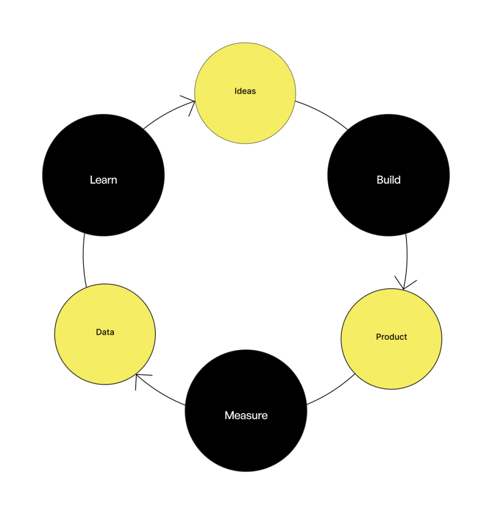
The Build-Measure-Learn Loop
The build-measure-learn feedback loop is a foundational concept in agile development. As designers, we aim to validate our ideas as much as possible before they go into production. After a product or feature is live, the user behavior and performance of your product should be measured, in order to learn from the results. These learnings can guide our focus for improving design effectively.
Where Does Analytics Fit in UX Research?
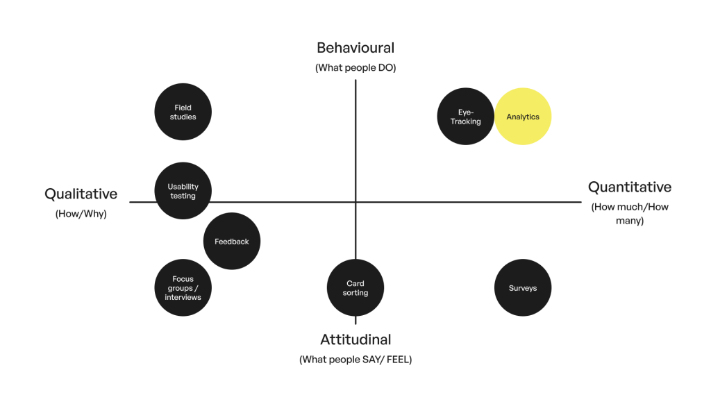
UX research spans a spectrum from behavioral (what people do) to attitudinal (what people say or feel) and from qualitative (how or why) to quantitative (how much or how many). Analytics fall on the behavioral and quantitative end: they tell us what users do, and how often. Broadly speaking, analytics can also offer qualitative insights, which we’ll touch on later.
Understanding the foundations of Web Analytics
With just a snippet of JavaScript and cookies, we can track the following information:
- IP address
This is a unique identifier, that helps us keep track of that user. It can also tell us where a user is from.
- Page visited and timestamp
- The source the user comes from
This can be from another website or via a search engine
- Browser, OS, and device information
Users, Sessions, and Bounce Rate: Core Metrics
With the data mentioned above, you can easily answer core metrics about your users like the following:
- Users:
How many unique users? Are they new or returning users? The retention Rate measures user return over time. - Page visits:
What are the most visited pages? - Sessions:
Individual sessions are initiated when a user enters and ends after 30 minutes of inactivity. The session duration is also a metric. - Bounce rate:
When a user leaves your website in less than 10 seconds. Without triggering any event (like filling out a form) or clicking through to other pages. - Organic vs. non-organic traffic:
Organic visits are earned and not paid for, like through a search engine. Non-organic are for example paid for. And direct traffic is without a source. - Exit rate:
How many sessions ended on a page, regardless of whether other pages were visited during a session.
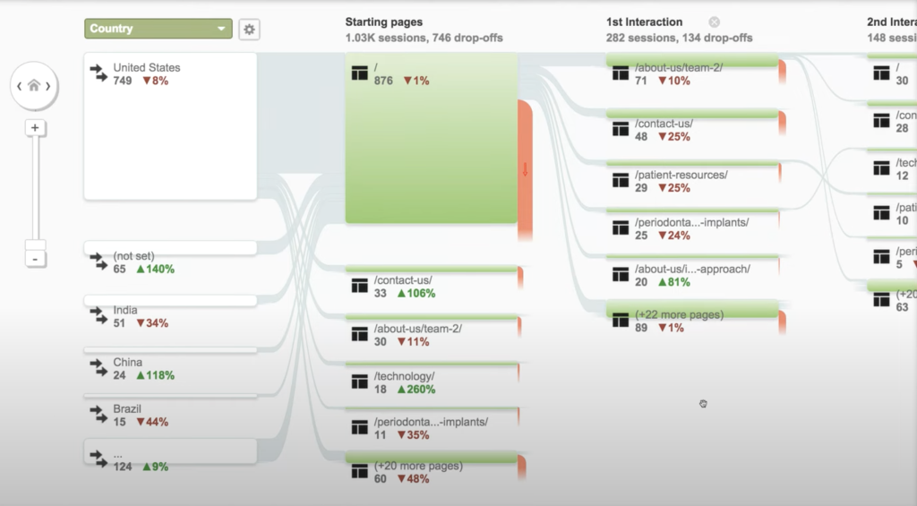
When you look at how these numbers variate over time, like a month, week or day, you can monitor how these statistics change over time and identify upward or downward trends. With the help of analytics tools like Google Analytics, data can be visualized into charts.
Another insight Google Analytics can visualize are user flows: how users navigate across your website, and what flows they follow.
Conversions
A conversion is when a user completes a desired action on your app, website, or software: something that aligns with your goals. Did the user do what we wanted them to do?
A conversion is any meaningful action a user completes:
- A page visit
- A completed purchase
- A form submission
- A completed signup
To track this, we use event tracking. Events are triggers on actions such as:
- Page load
- Button click
- App crash
- Scroll depth: This refers to how far down a page a user scrolls. Measuring scroll depth helps you understand whether users are seeing key content, or if important information is being missed because it’s too far down the page.
In order to track conversions, we need to decide what is the event on which we know this is happening. If it is a click on a certain button, an event should be triggered on clicking of that button for example. That event can then be tracked in metrics like:
- Conversion Rate: Percentage of users who complete a desired action, such as signing up or making a purchase
- Time on task: Duration users take to complete a task.
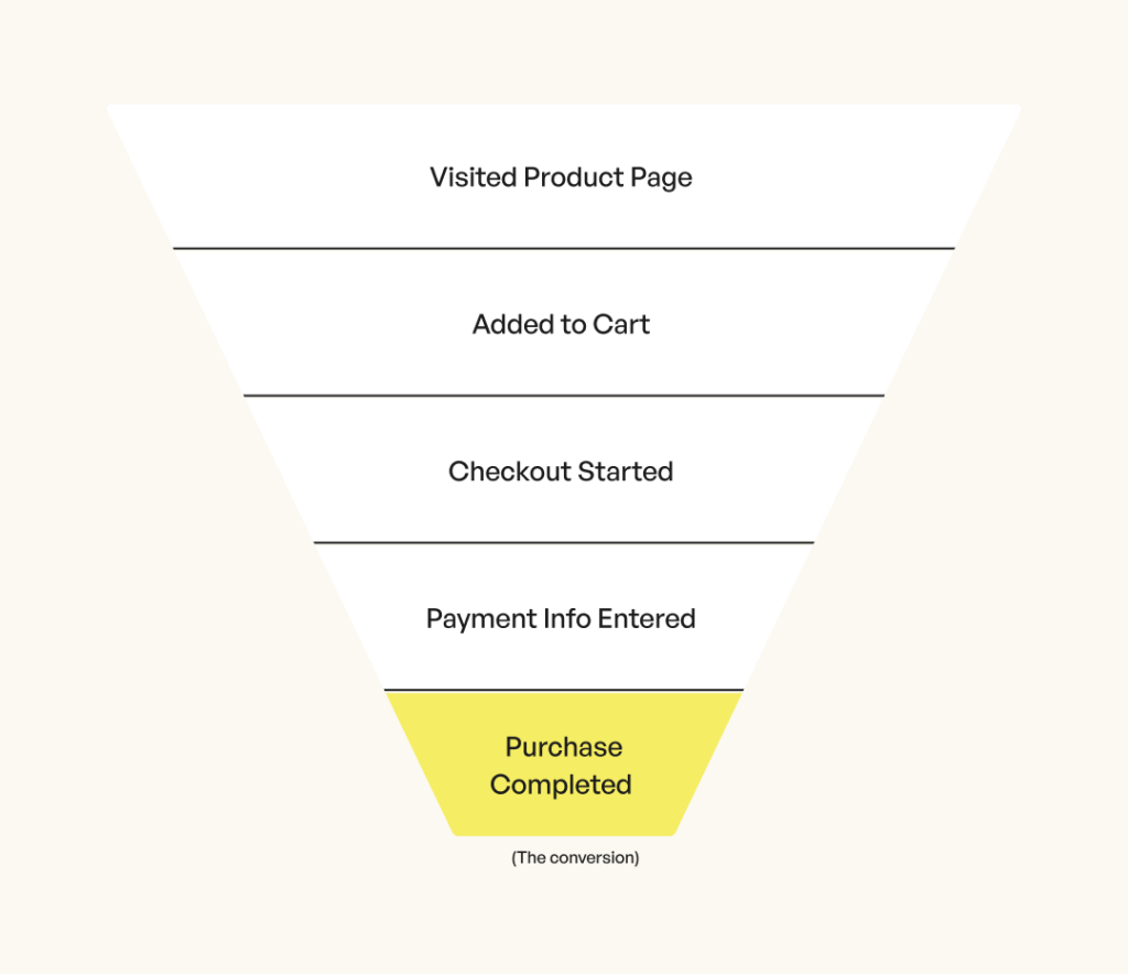
Funnels and drop-off rate
Funnels show the path users take to complete a goal. Let’s describe this by a classic example of a user wanting to buy a product:
- Visit product page
- Add to cart
- View cart
- Start checkout
- Enter payment info
- Complete purchase
If your funnel starts with adding the product to the cart, 100% people do that and the drop-off rate is 0%. Then 70% of those people clicked view cart. Then 60% of those people went to checkout. And of the people that checked out, only 18% saw the ‘Succes’ page, thus completed the purchase. The drop-off rate of each step, meaning the percentage of people that reached the page but didn’t continue to the next, visualizes where in the funnel users are lost. Although it is natural that the further along a funnel, lesser people ‘make’ it to the end, it can sometimes be an indication on where to look for improvement.
A/B and Multivariate Testing
Once you have a hypothesis you want to test, you might consider making changes directly to your app or website and observing the outcome. However, this is often a great opportunity to run an A/B test. A/B testing involves comparing two versions of something, like a web page or marketing campaign, to see which performs better. One version is the control (usually the existing version), while the other is the variation. Both are shown to similar audiences, and their effectiveness is measured using metrics like conversion rate.
A/B testing is particularly useful for isolating and evaluating a single change. When you’re dealing with multiple variables, though, traditional A/B testing can become slow and limiting. In such cases, multivariate testing provides a more efficient way to test various combinations at once and identify the most successful mix.
Behavioral Analytics
Tools like Hotjar and Fullstory add a new dimension and blur the line between qualitative and quantitative data. They show user behavior as if you were in the room with them.
You may be familiar with heatmaps from eye-tracking. Heatmaps can be generated from tracked user clicks, mouse movements, and scrolls on a certain screen. These are visualized into ‘heat’, just like movements of eye-tracking experiments would be. It allows you to see which elements where hovered on or clicked, and how far down the page users scrolled. It can expose that certain elements are not ‘seen’, or simply ignored.
‘Session recordings’ reconstruct a user’s journey across your site or app. With about every action from the user that is tracked as an event, this software generates a ‘playback’ of the session as if you are looking along the screen. The recording captures whether the user was on a desktop screen, how they scrolled, where they hovered with the mouse, and where they clicked. It also logs which page loaded, how long it took, and how the user navigated and interacted with the next page.
Smart signals
But playing back every session would be useless. Therefore, there are certain smart signals to look for!
Rage clicks are when users repeatedly click or tap on an element in a website or app (without going to a new page), indicating frustration. They can often signal underlying website health issues, including:
- Elements that appear clickable but aren’t
- Buttons that aren’t functioning properly or broken elements
- Invisible overlays
A trashed cursor is when the user is moving the cursor in a chaotic way very fast. Like rage clicks, it can be a sign of frustration.
An abandoned form is a form that was interacted with, but no Submit event has taken place. Watch what happens before and after they abandon the form.
Pinch-to-zoom: When a user or customer uses pinch-to-zoom to zoom in or out, it may indicate that your content isn’t rendering at an appropriate size, which can be an incredibly frustrating digital experience.
A Highlight might indicate (a part of) your text takes is hard to process or taking the users full focus to read.
Feedback
Analysis of quantitative usage data can tell you what users are doing, but not always why the user does things they do or how they feel.
Within analytics, these (qualitative) research methods fall too:
Pop-up surveys
Use pop-up surveys sparingly, as they can easily frustrate users. Especially if they ask for too much information and shortly after visiting a page. Keep them short and focused, ideally just a few questions.
On-page surveys
These surveys appear discreetly, usually sliding up from the bottom of the screen like a chatbot. They take up minimal space and don’t significantly interrupt the user’s experience, making them a more user-friendly option.
Short, focused questions can uncover insights like:
- Why did a user abandon a purchase?
- What feature is missing?
- What confused them on a page?
Feedback button
A feedback button allows users to choose the moment they want to share their thoughts. It’s especially helpful for capturing open-ended feedback. For instance, you might assume users are dropping off your product page due to lack of interest, but what if they’re unable to find the order button? With a feedback button, users can point this out directly. Sometimes, all it takes is one open comment to uncover a blind spot.
Conclusion
Analytics isn’t just about numbers. It’s about understanding real people through their actions.
Analytics empowers UX designers to:
- Improve usability
- Boost conversions
- Prioritize changes
- Validate ideas