Compliance obligations can sometimes overshadow a good user experience, especially in regulated industries such as banking. Excessive legal references, complex language, and inconsistent wording often confuse users and undermine their confidence in a product. But there’s a way to satisfy both legal teams and users. In this article, we share practical insights on how to build transparent, intuitive sales journeys without compromising compliance.
Understand the complete sales journey
Why it matters
Legal information can appear in multiple places-from marketing banners, to product overview pages, to the checkout process (such as opening an account or applying for a loan). Mapping the entire user journey, from first click to final consent, helps identify where legal content is appearing unnecessarily or duplicating itself.
Practical example
In a typical credit card application flow, users may see disclaimers on the home page, the product page, an in-app summary, and again at the final checkout. By identifying these “hotspots,” you can consolidate or move redundant content.
Collaborate with legal teams early
Why it matters
Often, “legal” becomes a bottleneck at the end of a project, leading to hasty disclaimers and band-aid solutions. Bringing compliance officers into the design process early ensures that you have time to challenge overly cautious requirements, request evidence, and discuss alternatives that still meet core legal requirements.
Practical example
Set up a short “legal alignment” workshop once the initial user flow has been mapped. Show the journey, highlight potential friction points, and present user-centric approaches (such as pop-ups or accordions) that keep the experience clean while still meeting regulatory requirements.
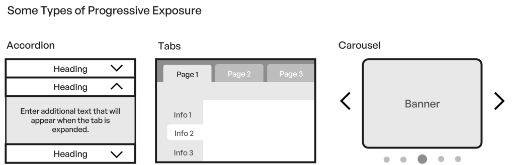
Use progressive disclosure to manage information overload
Why it matters
Banking products often have layers of complexity (interest rates, fees, insurance clauses, etc.). Users typically don’t want to read every detail at once, especially if they’re still deciding whether to proceed. Progressive disclosure shows the key points first, and lets users click or expand sections as they need more detail.
Practical example
On a savings account product page, the top section contains a concise summary of benefits and basic terms. Advanced details (such as penalty fees for early withdrawals or specific compliance disclaimers) are behind expandable accordions or a “Learn More” link.
Tips for success
Check with legal to determine which disclosures are mandatory at first glance. Anything else can be placed behind an accordion or “Learn More” button.
Confirm that the hidden content still meets any local requirements for accessibility and discoverability.
Maintain a single source of truth for legal citations
Why it matters
In banking, the same disclaimers, such as insurance terms or risk warnings, often appear multiple times across different channels and pages. If the wording is even slightly different, it can cause confusion, reduce user confidence, and increase the risk of legal errors.
Practical example
Create a shared “legal disclaimer library” that both designers and legal teams can update. Whenever disclaimers change, update them in one place, ensuring that every interface component comes from the same source.
Benefits include:
- Easier consistency checks
- Fewer repetitive compliance reviews
- Reduced risk of conflicting information in different funnels (such as savings vs. credit card)
Consolidate and simplify documents
Why it matters
Users may encounter numerous PDFs during a single product application: terms and conditions, insurance details, privacy statements, disclaimers, etc. Jumping from the app or website to PDF documents that open externally can log users out (for security) or disrupt their flow, causing confusion and abandonment.
Practical example
Bundle all required documents (e.g., terms and conditions, privacy policy, product disclosure) into a single web page within the app. Use anchored sections so users can jump to the parts they need, or download a full PDF if they prefer.
Track how often these sections are accessed. If users rarely click beyond the main content, consider further streamlining or moving infrequently read content to deeper levels.
Streamline consent requests
Why it matters
Scattering multiple consent checkboxes across different screens interrupts the sales flow and can lead to “legal blindness,” where users blindly agree just to move on.
Practical example
In a personal loan application, combine all compliance statements (e.g., data processing, insurance options, disclaimers) into one consolidated consent at the end. The user sees each statement but only needs to click to confirm.
Work with legal to confirm whether intermediate consents can safely be removed or consolidated. Sometimes regulators only require you to inform users once per session.
Keep it human and consistent
Why it matters
Legalese doesn’t have to be overwhelming or alienating. Clear, concise language builds trust and avoids confusion. Also, reusing the same terms (e.g., “interest rate,” “annual percentage rate,” “APR”) consistently across pages prevents users from feeling like they’re reading about a different product each time
Practical example
Instead of saying, “For more information about product disclaimers and related attachments, please see our terms and conditions,” say, “Want more details? View the product disclaimers and terms here.” It’s shorter, friendlier, and just as compliant-provided it’s properly linked to the official text.
Test and Measure
Why it matters
User testing can reveal whether legal blocks are causing abandonment, confusion, or frustration. Analytics can show which disclaimers people click on, how often they back out, and how they interact with your progressive disclosure elements.
Practical example
Conduct a quick usability test with a prototype. Ask participants to simulate opening a new credit card. Observe if they skip over disclaimers or get stuck when asked for consent. Use your findings to iterate the process.
Conclusion
In a banking environment, compliance with ever-changing regulations is non-negotiable. But it shouldn’t come at the expense of usability and clarity. By collaborating early with legal teams, applying progressive disclosure, consolidating documents and disclaimers, and streamlining consent requests, you can create an experience that is both user-centric and fully compliant. The key is to challenge assumptions, ask the right questions, and focus on real user needs, all while staying within the guardrails of local and international regulations.
With these practical methods, designers working in banking (or any highly regulated sector) can create sales journeys that educate rather than overwhelm them. It’s a balancing act: protecting your organization legally while building trust and loyalty through clear, transparent experiences.
Are you looking for an audit of the user experience of your banking app or website? Discover our Product Design Services or contact us for a tailored quote.