Grids have long been the backbone of UI design—a trusted framework providing structure and uniformity. But as devices diversify and interfaces become more dynamic, many designers are questioning whether strict grid structures are still serving our needs.
Enter gridless design—an approach that prioritizes content adaptability over rigid alignment, leveraging flexible tools like CSS Grid and Flexbox. This concept is not about completely abandoning grids but understanding their limitations and exploring alternatives that better serve both content and users.
Let’s dive into why product designers are moving beyond the grid and how gridless design can open up a new level of creativity and functionality in your projects.
The Role of Grids in Traditional Design
Historical Perspective
Grids have a storied role in design, originating in print and making their way to digital. They brought predictability and control, particularly with the 12-column grid that became a standard in responsive web design. Grids allowed designers and developers to create predictable layouts that adapt neatly across various device sizes—dictating where elements should sit within the viewport depending on device width.
Grids allowed designers and developers to create a consistent rhythm across devices, which was essential in the early days of the web when screens were simpler, and options for layout were limited. But product design has evolved. Today’s interfaces demand flexibility and adaptability that often conflict with the constraints of traditional grids. The question becomes: are grids now limiting the experiences we want to create?
Limitations of Conventional Grids
Rigidity and Responsiveness
Traditional grids, particularly the 12-column system, can feel too rigid in an era where devices range from smartwatches to foldable screens. Grids often force design elements into predefined spaces rather than letting them flow organically. This rigidity can make designs feel restrictive or forced, especially when users expect fluidity across devices. This means that while grids are useful for uniform layouts, they can fall short in responding to the nuances of different screen sizes—whether it’s a foldable phone, a smartwatch, or a new mixed-reality headset like the Apple Vision Pro.
Content vs. Device Focus
Grid-based layouts tend to prioritize device dimensions over the content’s needs. A grid may dictate where content sits, but it doesn’t always consider how that content functions across screen sizes. For a product designer, this often means sacrificing user experience for the sake of alignment, leading to a lack of design flexibility that modern interfaces demand.

Embracing Flexibility with CSS Grid and Flexbox
CSS Grid
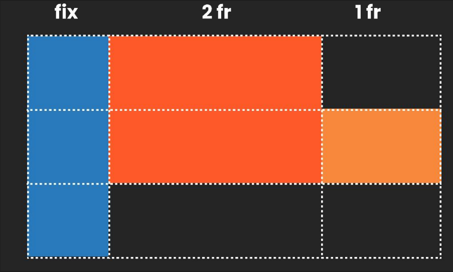
CSS Grid offers designers control over multi-dimensional layouts that work beyond the confines of traditional columns. With CSS Grid, it’s easier to create intricate arrangements that adapt to different viewports without sacrificing hierarchy or flow. Unlike strict grid systems, CSS Grid supports fraction-based columns, which allow designs to feel organic and content-first.

Flexbox
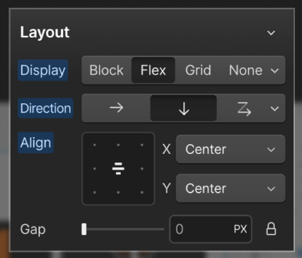
Flexbox, on the other hand, is ideal for managing content that needs to adapt within a container, especially when the size or order of elements may change. These layouts can create a more seamless flow that responds naturally to content changes, making it ideal for content blocks or dynamic components like image galleries, text blocks, and menus.
Design Tools and Developer Collaboration
The shift toward gridless design isn’t happening in isolation. Design tools are evolving to support these newer methods, with platforms like Figma’s Auto-Layout (which essentially mirrors Flexbox principles), and variable settings that enable designers to define spacings and gaps dynamically. Tools like Framer and Webflow have also expanded into low-code solutions, bridging the gap between design and development by requiring designers to think in Flexbox and CSS Grid terms. As design tools become more complex and developer-focused, designers can now create layouts that align closely with real-world, “coded” products, reducing back-and-forth and improving final product fidelity.
Developers, too, are increasingly moving away from page-based logic towards component-first logic, which aligns well with gridless design methods. In this setup, they’re working with container queries that adapt elements based on the specific component’s needs rather than enforcing a universal grid system. Figma’s Dev Mode and other collaborative features make this designer-developer sync smoother, allowing both to understand how the layout will look and function across screens, even with variable adjustments.

When to Break Away from the Grid
Strategic Decisions
Deciding whether to use a grid or to go gridless requires strategic consideration. In some projects, a strict grid system provides the necessary structure, especially when working on corporate or content-heavy sites that require visual consistency and order. But for more creative projects, where flexibility is key, a gridless approach using Flexbox or CSS Grid can deliver a better user experience.
Gridless design enables flexibility where it matters: navigation menus that adapt to user needs, hero sections that scale with screen size, and content blocks that respond naturally to varying screen dimensions.
Design Freedom
In gridless design, the content guides layout rather than forcing it into predefined columns. Flexbox works particularly well for elements like hero images, cards, and mixed media that need to adapt across screens. CSS Grid, on the other hand, is effective for complex layouts where content needs to stay organized yet fluid—think of product detail pages or multi-layered dashboards where flexibility and alignment must coexist.
For example, a component-based approach allows elements like cards or modular blocks to scale independently within their containers, ensuring that they’re not constrained by rigid columns. Flexbox and CSS Grid offer designers the freedom to adapt and innovate while also ensuring that layouts can be implemented by developers without requiring extensive reconfiguration.
Conclusion
Gridless design doesn’t eliminate structure; it liberates it. For product designers, embracing tools like CSS Grid and Flexbox means gaining the freedom to prioritize content, flow, and user experience over rigid alignment. Gridless layouts adapt not just to screens but to the real needs of users and their interactions, leading to designs that feel more intuitive, organic, and aligned with the device diversity of today.
As product designers, questioning the grid is about more than layout—it’s about rethinking how we design for the people who use our products. Gridless design is simply the next evolution in creating user experiences that adapt, respond, and resonate.
Subscribe to our Product Design newsletter here to stay informed on the latest in UX/UI design and beyond.